 Skip to content
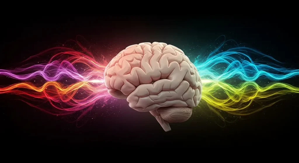
Colors are everywhere. They shape how we see the world and how we feel in it. But colors are more than just pretty shades—they have power. The psychology of colors shows us that they can affect our emotions, decisions, and even our mental health.
Have you ever felt calm in a blue room or excited by something red? That’s not a coincidence. Scientists and psychologists have studied how colors influence the brain. They found that certain colors can make us feel more relaxed, focused, or energized.
In this article, we’ll explore the psychology of colors and how different shades affect mood and mind. We’ll look at what research says and how you can use this knowledge in everyday life—whether you’re decorating a room, designing a classroom, or creating content for kids.
What Is Color Psychology?
Color psychology is the study of how colors influence human behavior and emotions. It’s a branch of behavioral psychology that connects visual perception with mental response. While it may seem simple, color impacts how we feel, think, and even how we act.
This concept is not new. In fact, ancient cultures used color to heal and influence mood. The Egyptians used colored light for therapeutic purposes. In modern times, marketers, educators, and designers all use color psychology to shape experience. Scientific research also backs this up. A 2006 study by Elliot and Maier from the University of Rochester found that red can increase alertness but also raise anxiety in test situations. This shows that color can trigger both emotional and cognitive changes—sometimes instantly
How Colors Influence Emotions and Mental States
Colors can trigger emotional reactions without us even realizing it. That’s because they’re processed quickly in the brain. They stimulate the hypothalamus, which controls hormones and mood. Each color sends a different signal.
For example:
- Warm colors (like red, orange, and yellow) are energizing and attention-grabbing.
- Cool colors (like blue, green, and purple) tend to calm the mind and lower stress.
- Neutral colors (like black, white, and gray) can bring balance or neutrality, but sometimes dullness too.
A study published in Color Research & Application in 2010 by Kaya and Epps found consistent emotional associations across cultures. Blue was linked to calmness and trust. Red was tied to excitement or anger. Yellow evoked happiness, but also anxiety in high amounts.
These findings show that color can set the tone in a space, a message, or a product—whether we notice it or not.
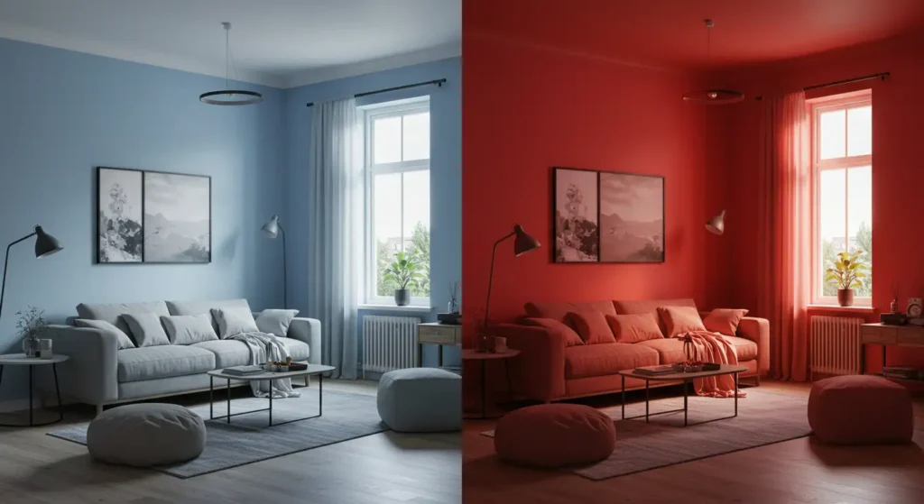
Red: Energy, Urgency, and Attention
Red is one of the most intense colors. It grabs attention faster than any other. This is why it’s used in stop signs, sale tags, and emergency lights.
Psychologically, red triggers the “fight or flight” response. It increases heart rate and blood pressure. That’s why it often makes people feel excited or even stressed.
In a 2007 experiment by Elliot, Rothbart, and Murayama, students exposed to red before a test performed worse than those who saw neutral colors. The red acted as a stressor, creating pressure rather than focus.
But red isn’t always negative. It’s also linked to passion, strength, and power. In small doses, red can motivate and energize.
Blue: Calm, Trust, and Focus
Blue is often called the most “liked” color in the world. It’s peaceful and cool. It reminds people of the sky and the sea—open, stable, and safe.
In a psychological context, blue has a calming effect on the mind. It lowers heart rate and reduces feelings of anxiety. That’s why hospitals, tech brands, and meditation spaces often use blue in their design.
A 1999 study by Kwallek, Lewis, and Robbins found that people working in blue-colored offices reported less stress and better focus than those in red or white spaces. Blue created a sense of control and clarity.
Too much blue, however, can feel cold or distant. The key is balance.
Yellow: Joy, Optimism, and Caution
Yellow is bright and full of life. It stimulates happiness and energy. It’s the color of sunshine, creativity, and cheer.
Research from a 2004 study by Hemphill in the Journal of Genetic Psychology found that yellow was the color most associated with happiness across multiple age groups. It activated areas of the brain linked to positive emotion and memory.
However, yellow can also be overwhelming in large doses. Some studies suggest that too much yellow—especially bright tones—can lead to frustration or irritability, particularly in children. That’s why it’s often used as an accent, not the main color.
Green: Balance, Growth, and Peace
Green is the color of nature. It symbolizes life, renewal, and growth. Psychologically, green creates a sense of balance and calm. It relaxes the eyes and mind.
A 2008 study by Küller, Ballal, and Laike showed that green environments reduce stress and support recovery from mental fatigue. That’s why green is common in hospitals, schools, and therapy spaces.
In branding and education, green is often used to promote harmony, responsibility, and learning. It’s especially helpful in spaces where calm thinking is needed. However, dark or dull greens can sometimes feel heavy or outdated if not used carefully.
Purple: Creativity, Mystery, and Imagination
Purple blends the calm of blue with the energy of red. It has long been linked to royalty, wisdom, and magic. In psychology, it often stimulates imagination and creative thinking.
A study by Baglione and Zajonc in 2005 explored how purple lighting affected creative performance. Participants in purple-lit environments scored higher on creative thinking tasks than those in white-lit rooms. This suggests that purple can inspire original ideas and deeper focus.
Light purple, like lavender, is also known for its calming and healing properties, especially in children’s rooms or wellness centers.
Orange: Enthusiasm, Warmth, and Motivation
Orange is a playful and energetic color. It combines the excitement of red with the friendliness of yellow. It’s often seen as sociable and fun.
Psychologically, orange can stimulate conversation, appetite, and movement. That’s why it’s used in places like gyms, cafes, and children’s play areas.
A 2012 experiment by Bellizzi and Hite found that orange hues increased customer interaction in stores and encouraged positive mood. But, like red, too much orange can feel intense or overstimulating, so it should be balanced with softer colors.
Black: Power, Mystery, and Depth
Black is bold and serious. It’s the color of elegance, strength, and sometimes fear. Psychologically, black can feel powerful but also isolating.
In educational or child-focused spaces, too much black can dampen energy. However, when used in contrast—like with white or bright colors—it adds depth and helps other elements stand out.
A 2013 review by Adams and Osgood found that people often associate black with control, sophistication, and authority. That’s why it’s popular in formal or minimalist designs.
White: Purity, Clarity, and Simplicity
White stands for cleanliness, peace, and clarity. It’s often used to create a sense of openness and order. In psychology, white helps reduce mental clutter.
However, too much white can feel sterile or cold. A 2011 study by Brebner and Senders showed that all-white spaces sometimes reduced attention and memory in learning environments. The brain needs some color contrast to stay engaged.
In design, white is best when combined with accent colors. It makes other hues pop and supports visual clarity.
Gray: Neutrality, Calm, and Practicality
Gray is neutral and balanced. It doesn’t excite or calm—it creates stability. Psychologically, gray can help tone down emotional intensity.
In office or classroom settings, gray can improve focus and reduce overstimulation. But overuse can feel dull or emotionally flat.
A 2010 survey by Naz and Epps showed that while gray was linked to logic and professionalism, it was also one of the least emotionally engaging colors. So it’s best used as a background or support color rather than a primary one.
How Children Respond to Colors
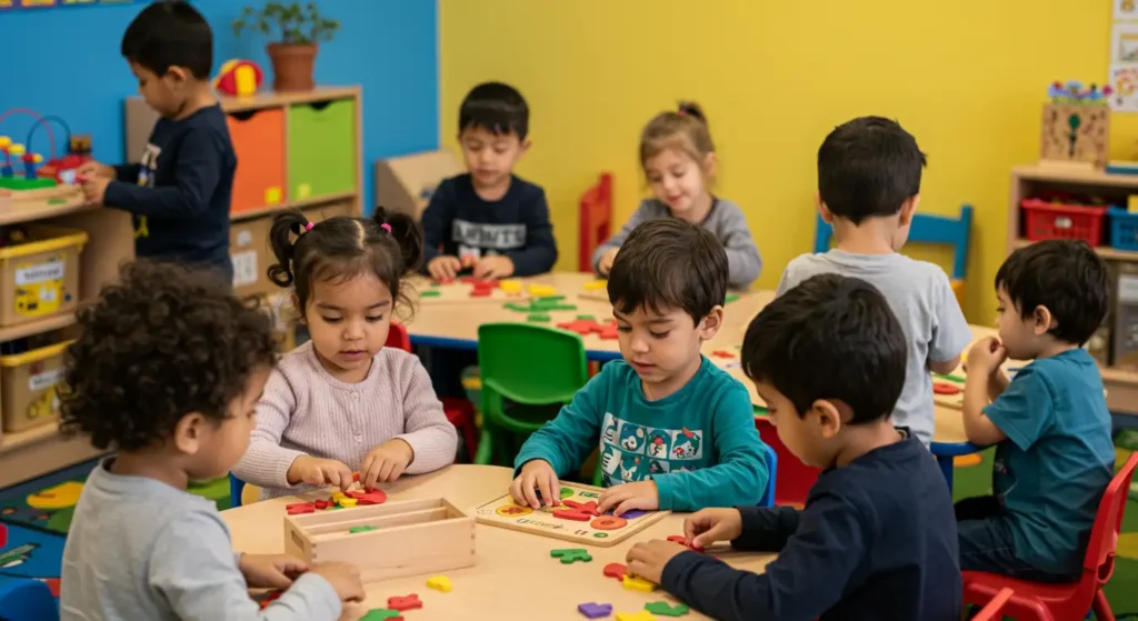
Children experience colors more intensely than adults. Their brains are still developing, and colors can strongly influence how they feel, behave, and learn.
Bright colors like red, yellow, and orange tend to excite younger children. These colors can boost playfulness and creativity but may also lead to overstimulation if overused. That’s why many preschools use them in small amounts—such as toys or accents—not on every wall.
Cooler colors like blue and green help calm the mind. A 2014 study by Read and Upington found that children in blue or green classrooms showed better focus and fewer behavioral issues than those in red or orange rooms.
The choice of colors can also impact memory and learning. In a 2012 study by Naz and Epps, children remembered more details from lessons that were presented on color-enhanced backgrounds—especially soft greens and light purples.
Understanding how colors affect kids can help parents, teachers, and designers build spaces that support emotional well-being and cognitive growth.
Using Color Psychology in Daily Life
You can use color psychology in everyday life without being a designer or psychologist. The key is to match colors with the mood or outcome you want to create.
In your home:
- Use blue in bedrooms to promote sleep and relaxation.
- Add green to workspaces to improve focus and reduce eye strain.
- Use yellow or orange in kitchens or playrooms for energy and warmth—just not too much.
In clothing:
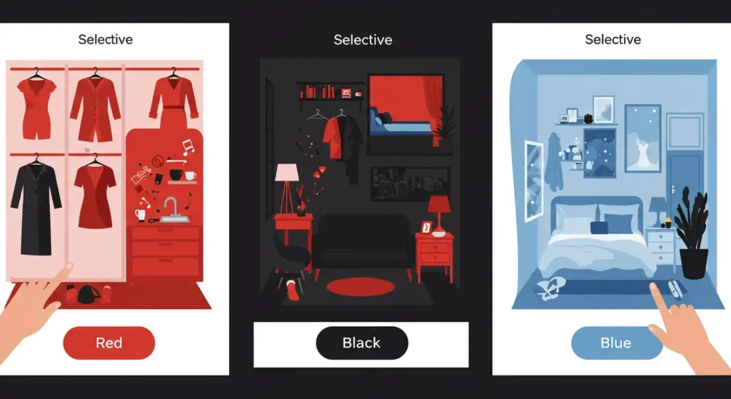
- Wear black for confidence and authority.
- Choose purple or green for creativity or balance.
- Avoid red before stressful events, like interviews, if you’re prone to anxiety.
For children’s spaces:
- Use soft pastels for calm and safety.
- Reserve bright primary colors for toys or activity areas.
- Keep learning environments color-balanced, avoiding harsh contrast or all-white designs.
By thinking about how colors affect mood and energy, you can create more supportive and intentional environments—at home, at work, or in educational settings.
Conclusion
Colors are more than just decoration. They shape our feelings, our energy, and even our mental health. From boosting creativity with purple to calming the mind with blue, every color has a psychological effect.
Scientific research has shown that our brains respond to color in complex but predictable ways. Understanding these patterns can help us make better choices in design, communication, and daily life—especially when creating spaces for children. Color psychology is not magic. It’s science backed by emotion and experience. By using it wisely, we can make the world more balanced, joyful, and mentally healthy—one color at a time
